WHATCHA THINKIN: GIANG NGUYEN, BEHALF STUDIO
- Hidden Saigon

- May 13, 2020
- 5 min read
Updated: May 21, 2020
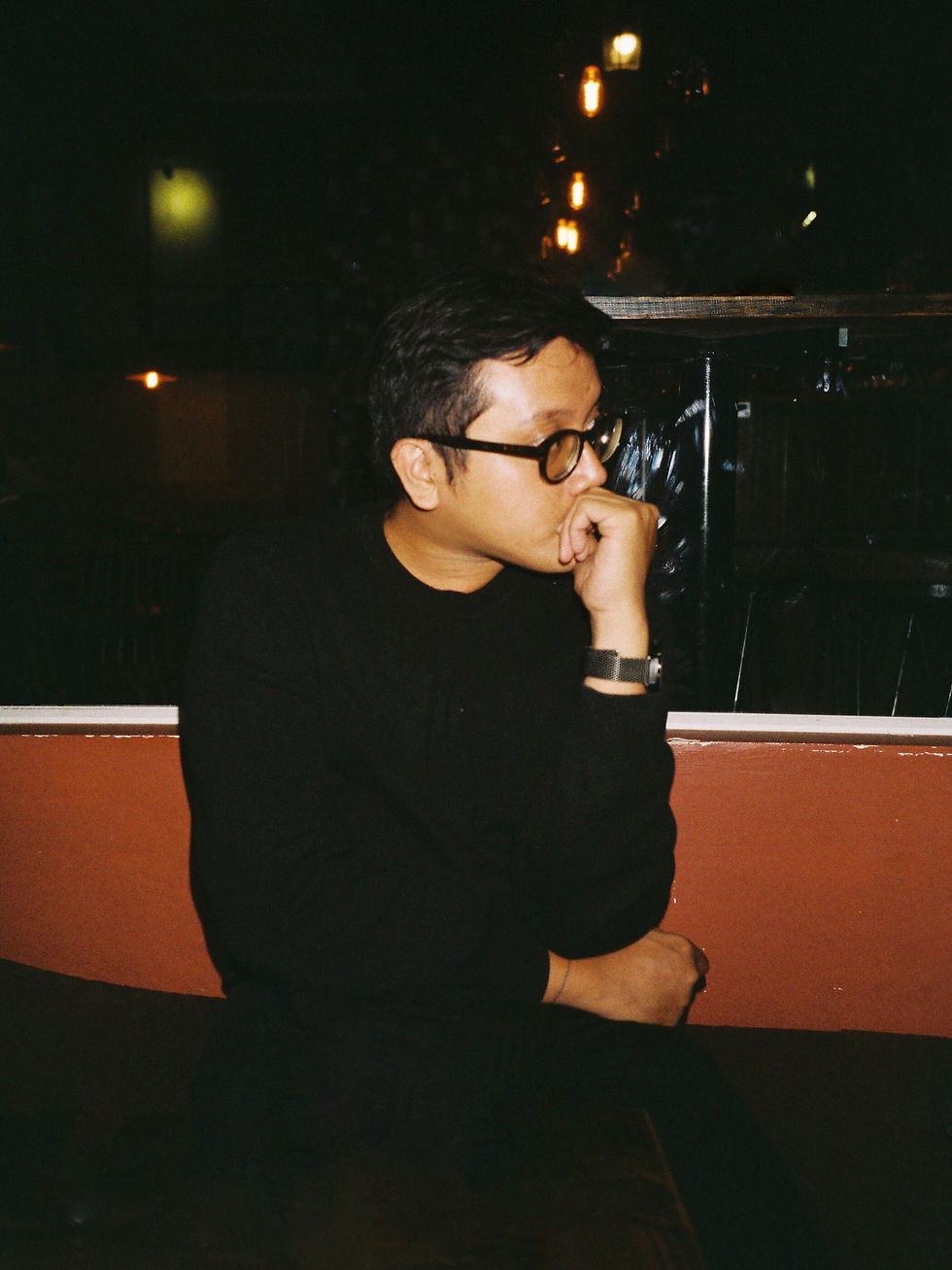
This week, we've invited Giang Nguyen from Behalf Studio to answer a few questions in Hidden Saigon's WHATCHA THINKIN series. Giang Nguyen is a multidisciplinary designer, studio manager, university lecturer, art maker, novice potter, amateur writer, avid reader, book hoarder, oddity collector, award loser, bike rider, pho eater, travel lover, food explorer, indie music listener, bad joke teller, Saigon resider. Rarely spotted in the wild, his natural habitat is either at a pocket-sized design firm called Behalf Studio or a classroom of RMIT University where he teaches digital media design.
Hidden Saigon (HS): Please tell us a little about Behalf. What is your mission for it?
Giang Nguyen (GN): Behalf is a design firm next door that you have probably never heard of. Behalf prides itself on being small, diligent, and exploratory. We provide various design solutions for our clients from brand identity design, graphic design, packaging design to digital product design. We also engage in non-commercial, community-driven art and design projects. We are passionate about working on meaningful projects with nice people around the world.
HS: What are some challenges you face as a boutique design agency?
GN: It’s still quite a relatively new industry that we’re functioning in, here in Vietnam. So figuring out the rope has always been the biggest challenge for me, especially when I’m not the most business-savvy person. What I find myself trying to figure out every day is the idea of “balance”, in a lot of different ways. The balance between the ideology to be “small and efficient” and the business’s sustainability. The balance between doing projects that keep the creative ember burning and gigs that keep the lights on (occasionally they will overlap). And (personally) the balance between work and life.


HS: Please tell us about the Republish Project. What is it? What prompted you to start it? What are your goals for it?
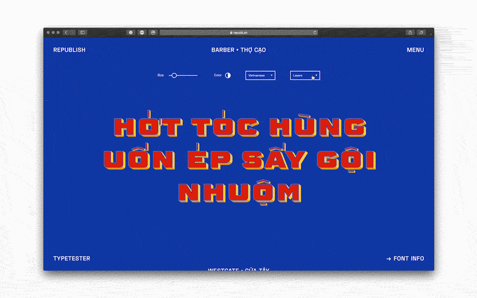
GN: Republish is a self-initiated project by Behalf Studio. The project studies the remnants of Vietnamese typography, which can be found scattered throughout the urban landscape. We then revive them into digital typefaces (fonts) for free, under creative commons license for the community along with storytelling components to share about these typography. This is our effort to return the unique but familiar aesthetics of local identity to the community.
It started as a continuity of my Master thesis, circa 2013, on typography and heritage. I found myself wandering around town documenting old typography, sign-painting art, modernist architecture and its facade letterforms. The notions of cultural identity, historic preservation, and degradation of cultural elements are often the center of my creative expression and research.


The first digital renders of the two typefaces Westgate & Barber were around this time. Yet they have not seen daylight until recently (7 years later) due to my hairsplitting tendency as a type designer and chaotic schedule, juggling teaching and design practice.
But now with Behalf’s team of capable and passionate young talents, I have finally put the project out there for the community. Goals-wise, we want to provide Vietnamese designers with the creative tools, raise awareness about the often-forgotten heritage elements, and (hopefully) contribute to the design identity of Vietnam. We hope that Republish will not only feature the typographic work of Behalf, but become the platform to showcase typographic work of similar nature from typographers here in Vietnam. Our next step is to bring this digital-format project into the physical realm, as publication or exhibition.
HS: What is the creative process when designing the typeface?
GN: We don’t usually have a fixated process when it comes to these typefaces. Usually dependent on its style and what characters can be traced from the remnants. We obviously start with the letters that are on the signs then work out derivable letters (ie. O -> Q, C -> G, etc.) then based on research of form and type style, historical era, etc. to make informed conjectures for the other letters and numerals. Oftentimes, even the ones that are included in the remnants would still need to undergo adjustments and reworks to fit the nature and fundamentals of the new medium. As a whole, it’s quite a speculative design process.
HS: How do you decide what piece to convert into a font? When do you know it’s done?
GN: As a team, we collect all these beautiful typographic remnants all the time. We have our library of materials, from wandering the streets of Saigon and taking photos of ghost type, collecting old books and prints, to just simply mining from the Internet and social media. While doing that, we would pick out things that are, firstly, inspire us visually. Other criteria would then involve, such as whether the typeface offers anything “new” or “interesting” to experiment with. For example, I was in love with the diacritic (dấu) placement of the type on Ben Thanh market’s signs, and that was the motivation.
One thing about self-initiated projects is that there’s no deadline. Designing & releasing typefaces is quite similar to making art, like a painting or a sculpture, in the way that you don’t usually have a particular deadline. And so to the type designers, it rarely ever feels “done”. If you stare at some details for some time you’ll always find things you want to nudge and if the longer you look at your work the more you’ll find it imperfect. At least that’s for me. I guess something is “done” for me when I start feeling like I’m okay with sharing this with people and I probably should move on doing something more interesting.


Republish Talk & Pop-Up at VCCA, Hanoi
HS: How has COVID 19 impacted your business and what have you done to sustain yourself through this?
GN: Many of our clients are in the entertainment and hospitality industry and got hit quite hard, and that subsequently affected us. One day we woke up with no more contracts to work on. Our team managed the social distancing week fairly well though. We utilized new tools to keep our conversations and discussions live like we were still in the same room. Things still get done. Less work means we had more time to finish up stuff on the shelf, particularly Republish. We are getting new contracts now so hopefully, we will slowly resume a sense of normalcy.
HS: Do you have any advice for young designers?
GN: Work hard. Don’t get comfortable with what you’re doing, always try to learn and experiment with new things. If you don’t find yourself learning new things all the time, you’re probably not growing.
HS: Can you recommend 5 books/films/agencies/campaigns that have inspired you?
GN:
Books:
● (fiction) Invisible Cities (Italo Calvino)
● (design) White (Kenya Hara)
● (typography) Designing Type (Karen Cheng)
● (misc) The Book of Probes (Marshall McLuhan, David Carson)
● (misc) On Bullshit (Harry Frankfurt)
Particularly for this project, I have to state that 2 magnificent sources of inspiration for me are the Facebook groups Saïgon Chợ Lớn Then & Now and the blog I Love Typography (ILT). One is filled with tidbits of Saigon’s history and the other is basically a massive resource for type nerds and history buffs. I also have great respect for Tim Doling (Saïgon Chợ Lớn Then & Now’s admin & main contributor) and John Boardley (ILT’s founder & writer). I can definitely swear by their publications as well.
HS: What are you listening to right now?
GN:
● Gorillaz’s Song Machine singles – can’t wait for the full album
● African Express’s EGOLI album
● Tame Impala’s The Slow Rush album
● Childish Gambino’s 3.15.20 album
● Phoenix and the Flower Girl’s Greenhouse album
● Glass Animals’ Quarantine Covers on Youtube


Comments